

Your deck is not a separate project. The moment it goes up, it becomes part of your home’s exterior — one continuous visual statement seen from the street, the yard, and every neighbor’s window. Get the color relationship right, and the whole property looks intentional and elevated. Get it wrong, and even a beautifully built deck feels like an afterthought.
This guide cuts through the noise of sample chips and showroom lighting and gives you the real framework for choosing exterior house and deck color combinations that hold up — visually and physically — for years.
Why Most House and Deck Color Combinations Fail
Most homeowners approach deck color as a standalone decision. That’s the first mistake.
They choose colors independently instead of reading the home’s exterior as one visual mass. They pull inspiration from Pinterest photos taken in Pacific Northwest light, then install the same color in a flat, full-sun Midwestern backyard — and wonder why it looks off. They over-contrast on small homes, creating a visual collision instead of curb appeal. They chase trending grays without asking whether that gray has warmth or undertones that conflict with their siding.
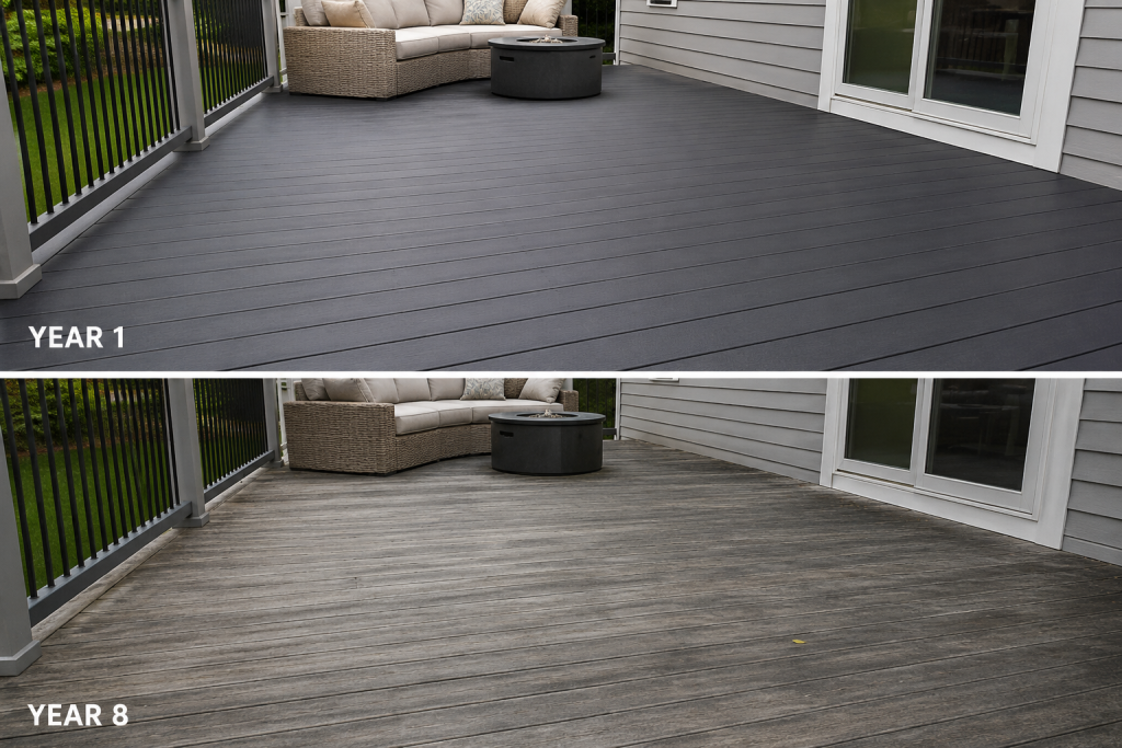
And then there’s the long game problem: many popular colors look stunning at installation and disappointing by year eight.
Avoiding these failures doesn’t require a design degree. It requires the right framework.
The 5 Rules That Determine the Right House and Deck Color Combination
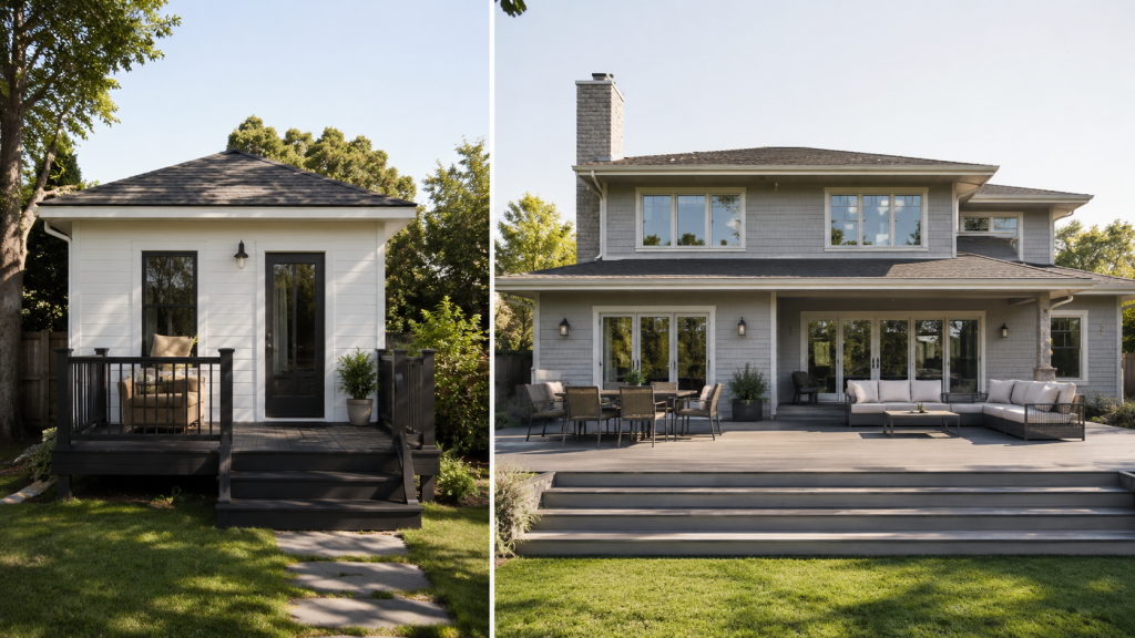
Rule 1 – Deck Size Changes the Color Rules
On a small deck, contrast amplifies — fast. A dramatic dark deck on a small home doesn’t read as bold; it reads as heavy. The deck visually dominates the façade instead of complementing it.
Large decks need visual grounding. A sprawling light-gray deck on a light-gray house creates a washed-out, undefined exterior. Slightly deeper tones anchor large horizontal surfaces without overwhelming the home above.
The principle: scale your contrast to your square footage.
Rule 2 – Deck Height Affects Visual Weight
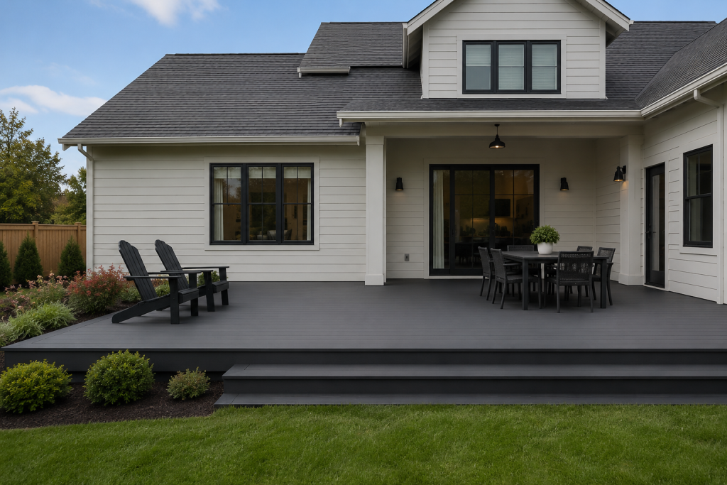
Ground-level decks behave differently than elevated decks. An elevated deck — especially one visible from the street — functions almost like a second story. If it’s too light, it looks like a floating platform disconnected from the foundation. A slightly darker tone visually anchors it to the ground and connects it to the home.
Ground-level decks have more flexibility. They blend into the yard naturally, so lighter tones work well without creating that floating effect.
Rule 3 – Sun, Shade, and Tree Cover Matter More Than Style
This is the rule most online guides skip entirely.
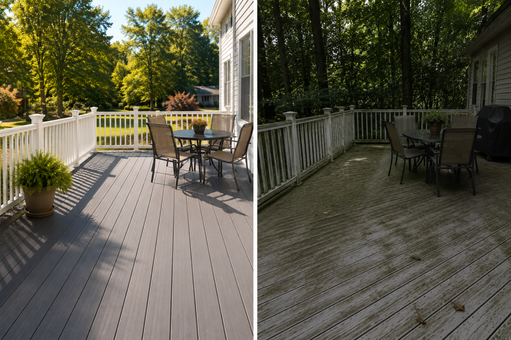
In heavily shaded yards — common in older Midwest neighborhoods with mature tree canopy — green pollen, mold, and organic debris collect visibly on light-colored decks. A color that photographs beautifully in a sun-drenched photo shoot may look perpetually dirty three springs into ownership.
Conversely, dark composite decking in full sun absorbs heat. In climates with hot summers, a dark deck in direct exposure becomes uncomfortable underfoot and fades unevenly over time.
“Your choice of material matters just as much, so it’s worth understanding how composite decking performs over time before committing to a color.”
Rule 4 – Trim Color Is the Missing Link
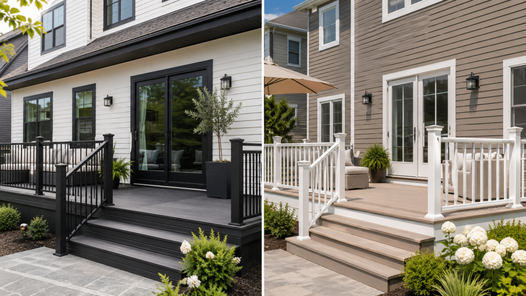
Trim is the bridge between your siding and your deck. Ignoring it is one of the most common reasons otherwise good house and deck color combinations still feel disjointed.
Match your deck fascia board to your window and door trim, and suddenly the deck feels architecturally connected — like it was designed with the house, not attached to it afterward. Use railing color as a visual transition: black aluminum railing works between a dark deck and a light house; white railing works between a light deck and medium-toned siding.
Rule 5 – Think in 10–15 Year Color Aging
Composite and PVC decking fade differently. Most quality composites stabilize after an initial weathering period; PVC tends to hold color longer but can show surface wear more readily.
Ultra-dark decks — charcoal, near-black — often look stunning for the first few years. By year seven or eight, uneven fading makes them look tired rather than dramatic. Mid-tone colors with natural variation (wood grain patterns, subtle streaking) age far more gracefully because they absorb visual wear into the texture.
Choose a color you’ll love faded, not just fresh, while also considering the deck’s expected lifespan.
Best House and Deck Color Combinations by Home Color
White Houses
White homes offer the widest range of options — but also the most rope to hang yourself with. High-contrast pairings (white house, near-black deck) make a strong modern statement on clean architectural homes. “On traditional or cottage-style homes, softer contrast, warm gray, sandy tan, or natural wood tones, feels more appropriate and ages better, particularly when choosing between paint or stain.”
Avoid pure-white decking against white siding. The result looks unfinished rather than cohesive.
Gray Houses
Gray is the most nuanced exterior color because it spans a wide temperature range. A cool blue-gray house clashes with warm brown decking; a warm greige house clashes with cool slate gray decking. Always identify your siding’s undertone before selecting a deck color.
For modern gray homes, a slightly darker gray deck with black rail accents creates a clean, monochromatic palette. For transitional gray homes, warm wood-tone composites or earthy browns add contrast without conflict.
Tan or Beige Houses
The trap here is over-browning. Beige siding plus brown decking plus wood-tone railing creates a muddled, one-note exterior. Break it up: pair a tan house with a warm gray deck — not a cool gray, which reads cold against warm siding — or add a crisp white railing to reset the contrast.
Blue Houses
Coastal blues pair naturally with light gray or driftwood-toned decking. In Midwest contexts, muted navy or slate blue homes work well with warm tan or medium brown decks. Avoid cool grays, which emphasize the blue-gray conflict. Keep railings neutral: white, black, or natural aluminum.
Multi-Color or Brick Homes
Brick and mixed-material homes are already visually complex. Let the house lead. Choose a neutral deck — warm gray, muted tan, natural brown — that doesn’t compete with the texture and color variation already present in the façade. A deck that fights a brick home for attention loses every time.
Modern House and Deck Color Combinations (Done Right)
Modern doesn’t mean dark everything. The most successful modern exterior house and deck color combinations use neutral decking as a canvas and let architectural elements — black window frames, cable rail, board-and-batten siding — carry the visual interest.
A light gray or warm white deck under a dark-painted modern home creates sophisticated contrast. A monochrome palette works beautifully when the geometry is sharp and clean — but falls flat on homes with inconsistent architectural details.
Small House and Deck Color Combinations That Don’t Overpower
For smaller homes, the goal is visual expansion, not visual drama.
Lighter decking extends the perceived footprint of a small home. Keeping the deck color within two shades of the siding — rather than sharply contrasting — reduces the visual interruption between house and outdoor space. Low-profile railings (cable rail, glass panel) keep sight lines open and prevent the deck from boxing in the home.
Avoid dark skirting on small decks. It shortens the visual height of the home rather than grounding it.
Deck Color Mistakes That Kill Curb Appeal
Matching deck boards to siding exactly creates a flat, unfinished look with no architectural definition. Ignoring railing color undoes even a great deck-and-siding pairing. Choosing trendy grays without warmth feels stark and cold, especially in northern climates with overcast winters. And forgetting seasonal light is a quiet killer — colors behave differently in January’s flat light than in July’s golden hour; test across seasons wherever possible.
How to Choose Confidently (Without Guesswork)
Get large samples — at least 12 inches — and place them vertically against your siding, not flat on a table. Flat samples reflect light differently than installed boards.
View them at three times of day: morning, midday, and dusk. Porch lighting dramatically affects how evening colors read, and morning light in the Midwest is cooler and bluer than afternoon light.
Finally, ask your contractor what they’ve seen age well in your region, including which sealing and staining approaches have held up best. Showroom lighting is controlled and flattering. Your contractor has seen colors two years post-installation on homes just like yours.
Conclusion
The best exterior house and deck color combinations don’t announce themselves. They make the whole property feel like one considered design — not a house with a deck bolted on.
Trend colors come and go. The combination that works is the one sized to your home, matched to your climate, connected through your trim, and chosen with its 10-year appearance in mind. That’s not a limitation. It’s what separates a good-looking deck from one that still looks right a decade later.